

The Role of Color in Landscape Photography
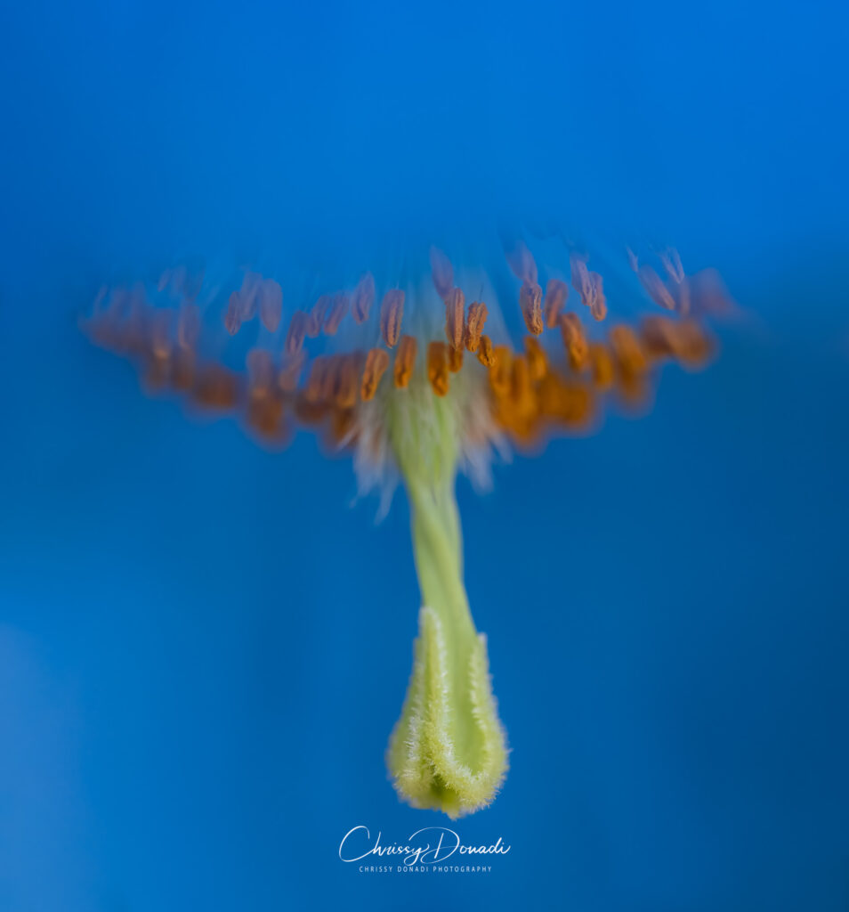
In nature photography, we know the magic that color brings to our images. Colors have this incredible ability to set the mood, grab attention, and convey emotions. Whether we’re after a vivid burst of a fire red or a subtle, calming palette of blue hues, it’s those particular colors that hold a special type of magic in the digital darkroom.
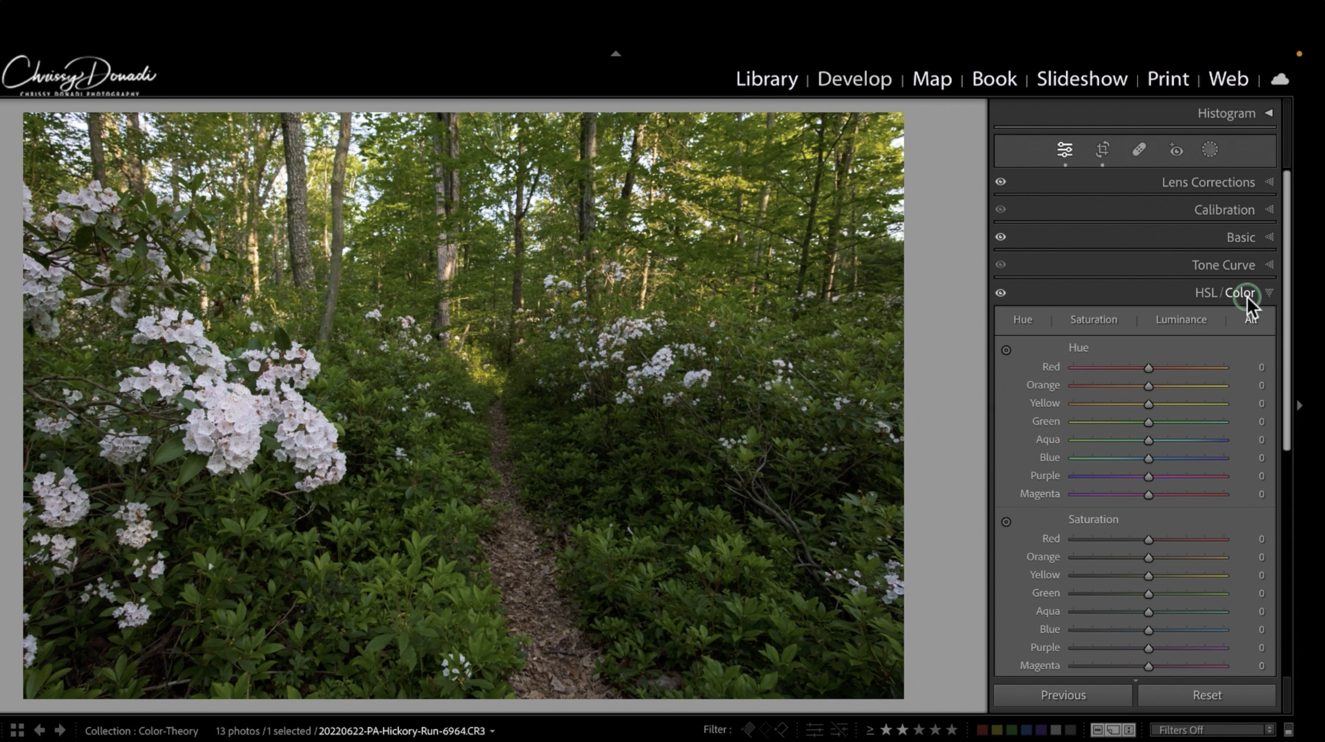
The HSL Color Panel in Lightroom’s Develop Module gives us the power of color sorcery. We use our wand of color to build emotions and narratives within every photograph. Don’t worry if it seems a bit puzzling at first – I promise it’s not as tricky as it looks. A quick and easy tutorial on hue, saturation, and luminance, will open up a treasure chest of creative opportunities. Unlike curves which target the tones in the image, the HSL color panel targets based on the specific color that you want to impact, giving you pinpoint control to make a color pop or fade into the background of the image.
What is the HSL Panel in Lightroom?
The HSL Panel is a precise way to target and adjust global colors within an image. HSL stands for Hue, Saturation, and Luminance.
- Hue is the actual color within the image, like picking a spot on the color wheel. It’s also known as the color’s temperature.
- Saturation is the intensity or power of the color, how bold or muted it is compared to the color’s degree of neutrality.
- Luminance is the “lightness” or overall brightness or darkness of a color.
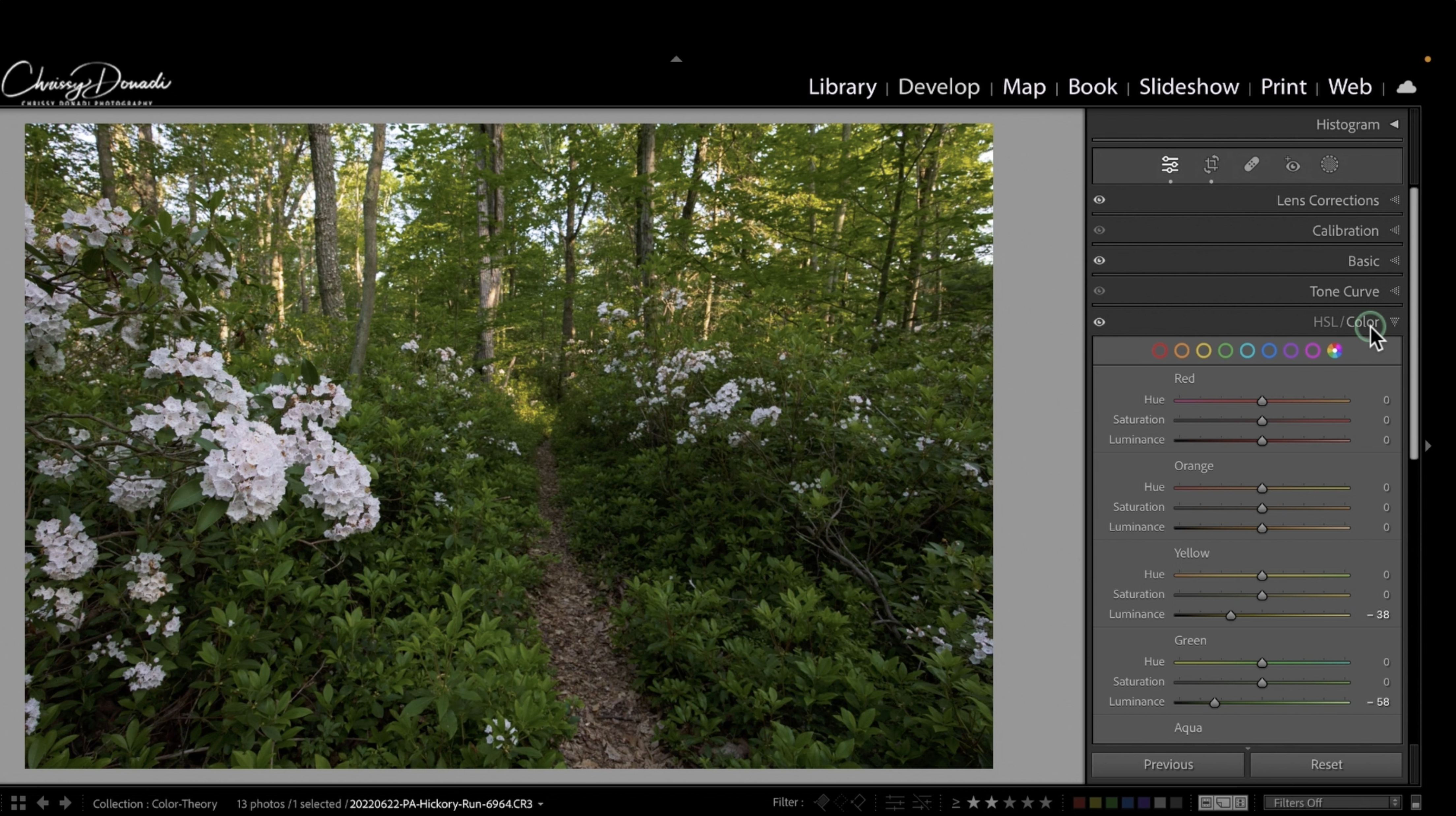
The power behind Lightroom’s HSL color sliders is they enable you to control the hue, saturation, and/or luminance of each of the red, orange, yellow, green, aqua, blue, purple, and magenta colors in the image. These eight colors cover the entire color spectrum providing endless options for targeted adjustments for a color in a photo. In other words, all colors can be described as a combination of their hue, saturation, and luminance values.
Making Hue Adjustments: Selecting a Color
Hue is the actual color within the image. Imagine a color wheel, and you’re picking a spot. But, a word of caution – go easy on the slider. A little goes a long way, and you wouldn’t want your serene forest to turn into a psychedelic wonderland. Want to turn that sky from calming blue to an otherworldly turquoise? Hue is your go-to magician. Just remember, a gentle nudge is often all you need.
Move the purple slider to the left, and your purples will become more blue. Move the purple slider to the right, and your purples will become more magenta (pink). An easy way to remember this is if you move the slider to the left, you are shifting the color toward the color slider above. And if you move the slider to the right, then you are moving towards the color below.
Let’s clarify that moving the purple slider only impacts the purple colors within the image, all other colors remain untouched. Additionally, there is no change to the saturation or luminance.


Changing Saturation: Color Intensity
Saturation is the intensity or power of the color. It’s like your color amplifier, making colors boldly and vibrant to command attention or soft and dreaming to seamlessly blend into the tapestry of a composition.
In general, RAW files appear muted, so boosting colors is a common desire. The power of the HSL slider compared to the one found in the Basic Panel is the targeting of a specific color for adjustment rather than globally impacting all colors in a photograph. If we crank up our saturation slider in the Basic Panel, then we’ll probably produce colors that jump off the screen. By using the HSL color slider, we can choose one or two colors to pop and desaturate others to fade into the background.


Making Luminance Adjustments: Painting with Light
Luminance is the Jedi master of brightness and lightness. It dictates how bright or dark a color appears. For example, playing with luminance for greens and yellows in a forest scene can make shifts from sunlit warmth to more mysterious shadows. It’s like directing a spotlight for drama or crafting a serene ambiance.
In this way, it can be helpful to give a boost to the colors of the subject and darken down colors you wish to recede more into the background. The dynamic range or tonal separation isn’t impacted when you change the luminosity, which is why it is a powerful way to lighten or darken a single hue. This color separation helps draw the eye to the subject of the composition. By adjusting luminance, you orchestrate the interplay between light and dark, sculpting a narrative that engages the senses.


What is the difference between HSL and Color in Lightroom?
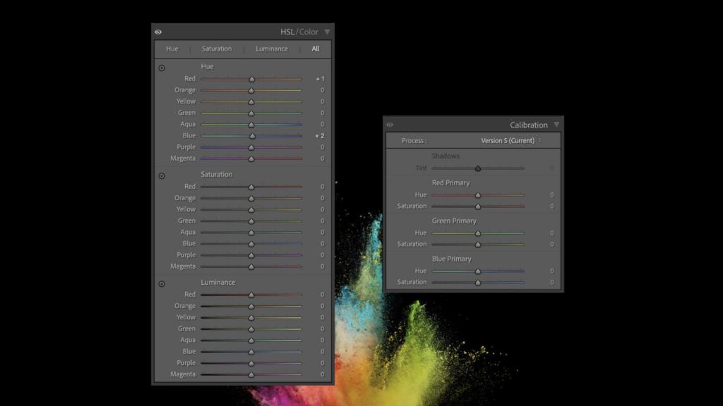
The color option on the top of the panel is just another way to view the options. HSL will combine all your Hue options for each of the red, orange, yellow, green, aqua, blue, purple, and magenta colors together. Then, all your Saturation color sliders are grouped together, followed by all your Luminance slider options group. The Color view shows the Hue, Saturation, and Luminance grouped together under each of the eight color options.
While this Color option seems simplified, don’t get too cozy. It tends to be a less efficient way to edit colors Real-world colors often dance between categories making it hard to pinpoint the exact color mix. It just ends up being lots of extra clicking back and forth as I tried to determine the exact mix of colors in a particular area. The fastest way to start editing the colors of your image is to use the Targeted Adjustment Tool.
The Secret Power of the Lightroom’s HSL Targeted Adjustment Tool
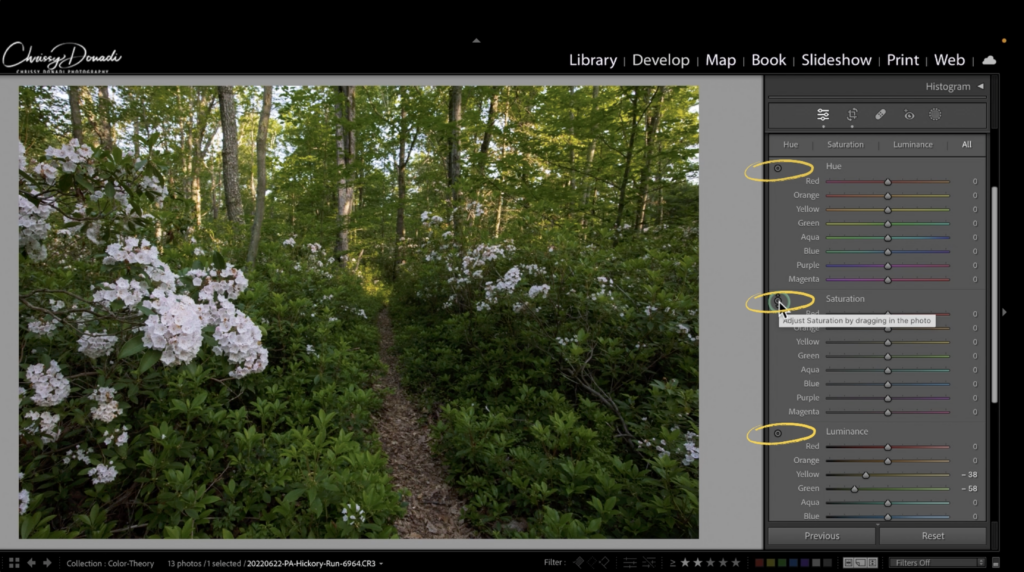
Within the HSL Panel lies a hidden treasure – the targeted adjustment tool. Very seldom do you encounter a pure valued color, colors in the real world are a symphony of intertwined hues. The targeted adjustment tool allows you to meticulously select a part of your image and learn its color combinations.
Click on the tool in the panel to activate it, and then scroll over to the area of the image you want to adjust. Click and drag the tool up or down to make the adjustments. By using the targeted adjustment tool, you can pinpoint exactly what combination of colors falls within a particular area of the photo. With that knowledge, you can be even more selective with your color adjustments. And just like that, you have elevated your powers of color manipulation prowess, ultimately giving you more creative control over the finalized image.
What is the difference between the HSL/Color and Calibration Panels in Lightroom?
In Lightroom, both the HSL (Hue, Saturation, Luminance) and Calibration tools are used to manipulate colors in your photos, but they serve different purposes and offer distinct ways of adjusting color tones. HSL allows you to target and modify specific colors within your image. Assuming a regular landscape photo with multiple aspects, changing some sliders in Lightroom’s HSL panel will impact a portion of the overall pixels in the image.
On the other hand, the Calibration Panel adjusts the overall color balance and how the three color channels of red, green, and blue are blended at the pixel level to create all of the colors in an image. This impact ultimately influences the overall color cast and mood of the image. When you move the hue slider, you are impacting how every underlying color value in the image is rendered/mixed.
The Tint slider adjusts the tonal response of the corresponding color channels in the darker areas of the image (note it says Shadows above it). Adjusting this slider can help fine-tune the color balance in shadows and contribute to the overall mood of the photo.
The Calibration panel is particularly useful when you want to achieve specific color effects or correct color casts in your image. It’s a global way to customize the color interpretation of your RAW color data from your sensor.
Unleash Your Color Symphony with Lightroom’s HSL Color Panel
In the quest for vibrant, evocative landscapes, the HSL Panel stands as a beacon, beckoning you to explore its realms. I hope this tutorial gave you the power to become your own composer of color. It’s your chance to compose a visual masterpiece that resonates with your artistic soul.
Within my editing, I generally conservatively adjust hue first. Conservative in the sense that I’m trying to only get to the color I remember seeing while I was photographing. At times, luminosity can impact contrast which will boost your saturation. For this reason, in general, I’ll play with the luminance sliders first and then saturation. I don’t always use all three of the sliders. Rather, I pick and choose based on the specific image. If I had to choose one, I tend to tinker with luminance more than the others.
A symphony of color awaits, waiting to be conducted by your creative hand. Just as a conductor guides an orchestra to create harmonious melodies, you, too, wield the HSL Panel to compose visual symphonies that resonate with your artistic vision.
🌈 Happy editing! 🌈
Chrissy, thank you. Their target adjustment tool is such a game changer! I rarely used HSL because it was so hard for me to figure out which colors I actually wanted to change. It will be so easy now.
Glad it helped! Although, Adobe just made a big update to that panel. Although the principles still stand in understanding the difference between hue, saturation, luminance, and calibration. Cheers to you!