

As photographers, we spend so much time focusing and learning about photography. There are countless articles, blogs, and videos telling you everything you need to know about gear, locations, light, and editing. One important aspect which goes under the radar is how to setup your home office for photography. Almost every photography instructor will share the importance of calibrating your monitor, but how many expand the lesson to include the right office wall color and light you need to create the best home office environment? Insert a melody from crickets here.
I can’t blame them; this is as fun a topic as organizing your Lightroom. But I think if I can make organizing fun (yes, more than two reviewers dared to say that I made it enjoyable and none of those individuals were my mother), I’m willing to be the one of the few to tackle practical advice for setting up your photography office. Let’s assume that you already know the importance of having a good computer monitor and that you calibrate your monitor regularly, here are the other two big things to consider setting up your photography office.
Office Wall Color for Photo Post-Processing & Printing
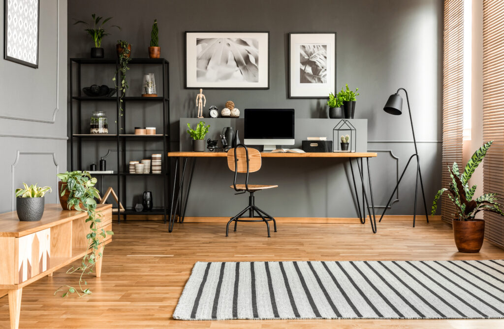
The wall color of your office is important. It can block light, reflect light, or even introduce color casts. For our eyes to see colors while editing on a monitor accurately, the environment should be as close to chromatically neutral as possible. White walls are probably common, it allows light to bounce around the office. Perhaps, it seems bland, but it keeps things simple. As long as you don’t have yellow lights shining on a bright red sectional couch or something like that in your office, white walls will work just fine for many of us.
Although, when you ask the color experts of the world, gray walls are the recommendation. Gray walls will not reflect or block light. More importantly, gray walls create an environment that is chromatically neutral, meaning it minimizes color casts interpreted by our eyes. And even though that doesn’t need to factor into the equation, gray walls are a popular interior design choice (thanks Joanna and Chip Gaines)!
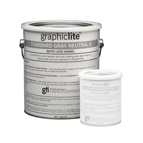
What type of gray should you be selecting from the myriad of options at your local hardware store? Look for a standard neutral gray, neutral being the key. Better yet, if you’re going to take the plunge paint your office walls gray, go all in for the GTI Standard Gray Neutral 8 (N8). This is paint specifically designed to have a “spectrally flat response without any color bias.” It’s made for color viewing areas in the graphic arts and photographic industries. As a little factlet, N8 is ideal for photo editing, whereas N5 is designed for video editing. Who knew?
Office Lighting and Light Bulbs for Photo Editing
Perhaps this practice is a derivative from the darkroom days of analog, but I’ve heard enough photographers claim that they like to edit their photos in the dark or at night with a little lamp light. Here’s a deep dark secret, I did that too many moons ago. But as with landscape photography, we need to look to the light. As with the color of the walls, we’re looking to have neutral, color balanced, and consistent lighting.
First, attempt to have the lighting in your office be consistent. Suppose you have a big window in your office that floods your office with light during the day, and then you have a little office lamp that provides some luminance at night. These two drastic changes in light impact your editing. For example, if you view a night-edited image during the day, you’ll probably find that your processing looks a little too dark. The one edited in the daylight will look way too bright when viewed again in your bat-cave at night. The goal is to create consistent workspace lighting for your editing sessions.
What’s wrong with windows? Daylight is excellent, but it does change throughout the day. While I love my big office windows, I make sure I have blackout shades to use when needed. Then, I strategically place my lights so they are not directly in front or behind my monitor. This ensures the light source doesn’t reflect directly on the monitor or play tricks with my eyes by being directly in my purview.
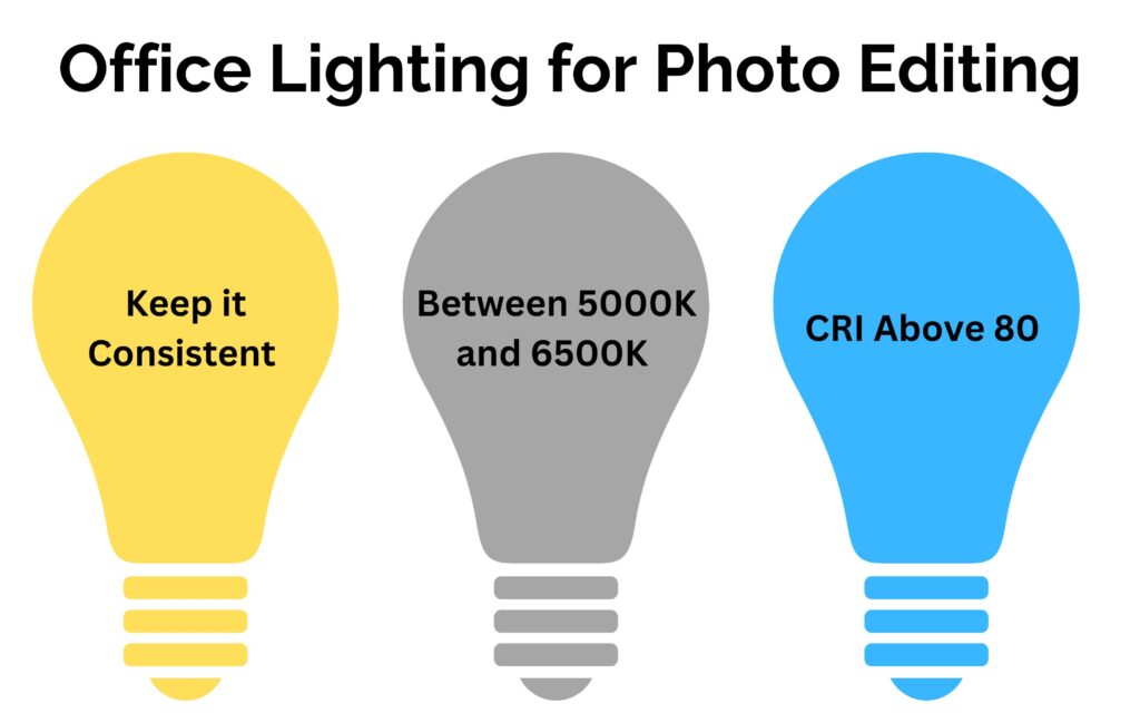
The popular light bulbs designed for our homes are made to be warmer in temperature. They are around 2000K-3000K, and called “candle white” or “soft white”. That’s great to make our living rooms cozy, but isn’t the best for color balanced light in our photography offices. Generally, the color temperature of computer monitors is set to 6500K. With this in mind, it makes sense to have the lighting in your room match the same temperature. Although, that may seem a bit too cool, almost sterile. You want to enjoy being in your photography office.
For this reason, I have found that many of my photography friends who are heavily into printing prefer to use lights that are 5000K. It’s close to the 6500K and adds a bit of warmth to make the office cozier. Then, they compensate for the lighting bias by making adjustments when calibrating the computer monitor. For example, they will test out the color temperature settings for the monitor to compensate for the warmth. A cooler temperature on the monitor settings will balance out the warmer lighting in the room.
Finding a bulb with a daylight color temperature between 5000K and 6500K is one half of the equation. The second part is to look at the color rendering index (CRI) of the light. The CRI is an assessment of how the light source shows an object’s colors “naturally” and is independent of color temperature. The index runs from 0 to 100. At zero (0), all colors look the same. Whereas a CRI of one hundred (100) shows the true colors of objects. In general, anything with a CRI between 80 and 90 is considered good, and anything above 90 is the bee’s knees (or excellent). The higher your light bulb’s CRI, the better the color rendering capacity.
Conclusion
Many photography instructors regularly tell students that they should calibrate their monitors. And yes, I agree that is of critical importance. However, it’s equally important to consider the conditions you are working in when post-processing and printing your images. By creating a spectrally neutral environment and making a few lighting adjustments, you can create an environment to improve the consistency and color accuracy of your photos.
Now, this is just scratching the surface down the color accuracy rabbit hole. There is so much more and the science behind all of this is fascinating (at times). I’m not saying you need to run out and purchase N8 paint. Rather, these are simple considerations to create a better post-processing environment. Start with maybe just changing a lightbulb.
+ show Comments
- Hide Comments
add a comment