

Setting your white balance in Lightroom is a critical first step in your editing workflow. If your white balance is off, it can skew all subsequent edits, impacting the accuracy of colors as you layer on your adjustments. Correcting the white balance at the start of your edit ensures that your image’s colors are true to life, laying a solid foundation for all other editing steps you take to produce the final image.
Step-by-Step Guide to Setting the White Balance Properly
Select the photo you wish to edit and then open up the Basic Panel on the right-hand side of Lightroom Classic’s Develop Module. Here you will find where you can set your camera’s profile, white balance, tone, and presence. One of the first steps in my editing workflow is to set the white balance because it sets the foundation for every other processing step.
Step 1: Use the Picker Tool/Eyedropper
Now, you can opt to choose one of the automatic selections of Auto, Daylight, Cloudy, Shade, Tungsten, Florescent, or Flash. However, I much prefer to use the Picker Tool, which looks like an eyedropper, to help me target the perfect white balance for each image I choose to edit. All you need to do is click on the eyedropper from the Basic Panel in Lightroom. Your mouse curser will turn into an eyedropper. Next, you hover over your image and pick a spot for Lightroom to utilize in customizing your white balance for the photo. But where exactly should you be clicking on the image?

Step 2: Select a Neutral Area
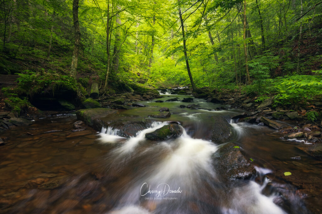
With the picker tool active, move it over your photo and look for an area that should be neutral gray or white. In nature photography, ideal spots include gray rocks, patches of snow, or clouds on an overcast day.
Click on the selected neutral area. Lightroom will adjust the Temperature and Tint sliders automatically to balance the colors based on that reference point.
Why This Spot? Neutral areas help Lightroom understand what true white or gray should look like in your scene. This allows the software to correct any color casts and ensure accurate colors.
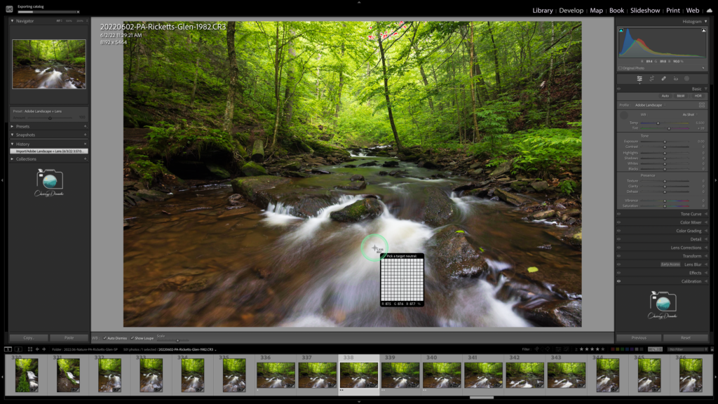
Tip: If you’re unsure if an area is neutral, watch the Navigator panel (top left) as you hover over different parts of the image. The preview will show you the effect of clicking that spot.
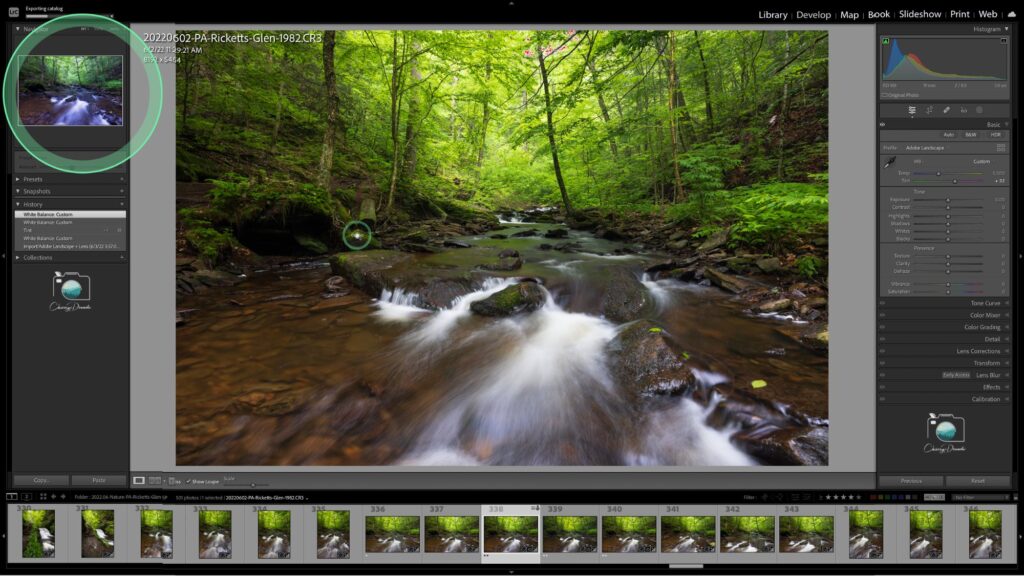
Step 3: Fine-Tune Your White Balance
Ensure the colors in your scene look natural considering the landscape and type of light. Take note of any trees. Are they the right shade of green? Check if the sky is a correct hue of blue, and so on.
Tips for Using the White Balance Eyedropper
For nature and landscape photographs, the best areas to pick with the white balance eyedropper in Lightroom are:
Gray Rocks and Boulders: These often can provide a neutral gray reference point.
Snow: That white blanket, provided it isn’t blown out in the photograph, can provide a great neutral reference point, especially on a cloudy day.
Clouds: Overcast clouds can offer a neutral tone for balancing your image.
AVOID shadows and colors: You’ll want to steer clear of shadows and brightly colored areas. Using them to set your white balance will certainly throw off the natural color balance and create color casts within the scene.
Advanced White Balance Tips and Tricks
Use the Histogram: Check the histogram while adjusting your white balance. A well-balanced histogram with no major color spikes in one area can indicate a good white balance.
Batch Processing: If you have multiple photos taken in the same lighting conditions, set the white balance on one photo and then sync the settings across all photos to save time.
Reference Photos: Consider taking a reference photo with a gray card in the same lighting as your landscape shots. Use this reference photo to set the white balance accurately and then apply the same settings to your other images.
By following these steps to set your white balance in Lightroom, you’ll ensure your nature and landscape photos have accurate and pleasing colors, providing a solid foundation for all other edits. Happy processing!
Sometimes you don’t want to use the picker. You don’t want to turn a sunrise or sunset into a midday WB, and sometimes the white snow or sand will be reflecting different spectral of illumination from different parts o the sky. This can be accentuated in post by brushing in slight changes in WB.
Human vision is sensitive to color contrasts. Using masks a different WB can be created for backgrounds thus accentuating the subject (a color vignette, if you will). I am using this trick often with wildflower images. For instance I may present a blue flower against a slightly warmer (yellow) and red tinted background, or a yellow flower against a cooled background.
So WB can be artistically creative instead of dead-on accurate.
Indeed our brains quickly adjust perceived WB to compensate for for perturbations (up to a point), such as when we don sunglasses. Our brains are more keen on detecting color contrasts than on the absolute WB.
You’re absolutely right! This article is more about encouraging the habit of reviewing and understanding how to set your white balance early in the editing process. Often, I find it’s something overlooked entirely and then managing your colors on your edit become very difficult. Naturally, if the light in the scene calls for a color cast, then you want to ensure those colors are reflected in the final image.
As you mentioned, our perception of white balance is not absolute; our brains do a lot of work to maintain color consistency despite changing lighting conditions. This adaptability allows us as photographers to be creative with color to evoke specific emotions or atmospheres without worrying too much about technical correctness. I often use split toning in my images as well, cooling the shadows and warming the highlights to appeal to the viewer’s eye.
Thank you for sharing. I might add another clarifying paragraph as soon as I get home from travel. Cheers to you!